Privacy policies are usually so long and dense that I do not think most people realistically read them. I wanted to see how much clearer the same kind of information could feel if it was actually designed to be read.
The readability problem
The existing policy is long, repetitive and visually almost identical from section to section. I found it very easy to lose my place, which is a problem when the whole point is supposed to be understanding what you are agreeing to. I wanted to keep the important information while giving it enough hierarchy to feel possible to get through.
Exploring how much to show
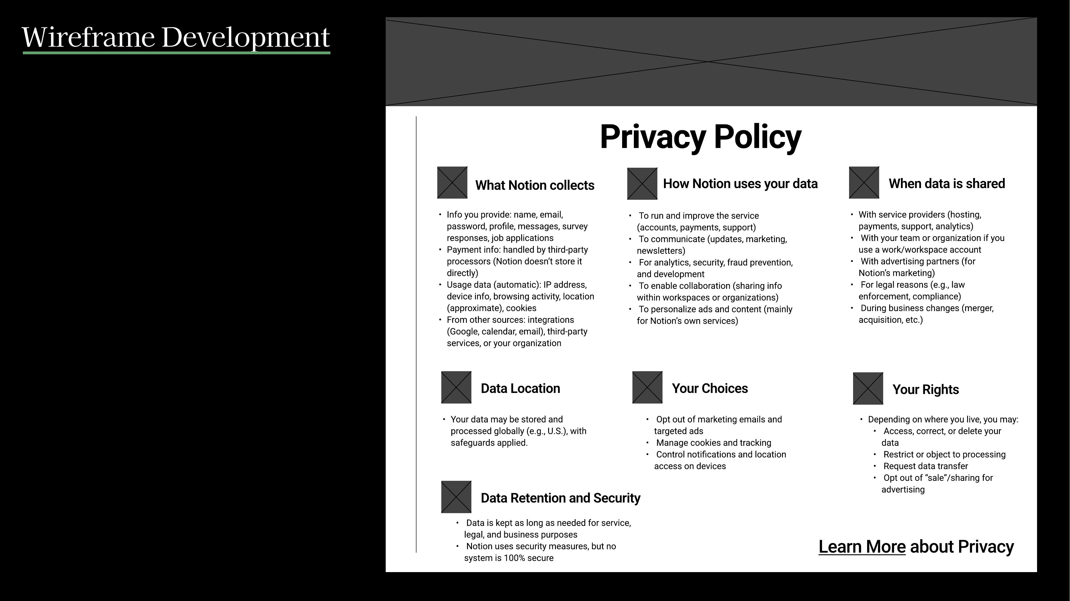
I explored a few ways of breaking the information apart, including icon-led sections, dropdowns, a carousel and a more straightforward reformatting. I kept coming back to the same problem: the user should not have to face one enormous wall of text all at once.
Building a scan pattern
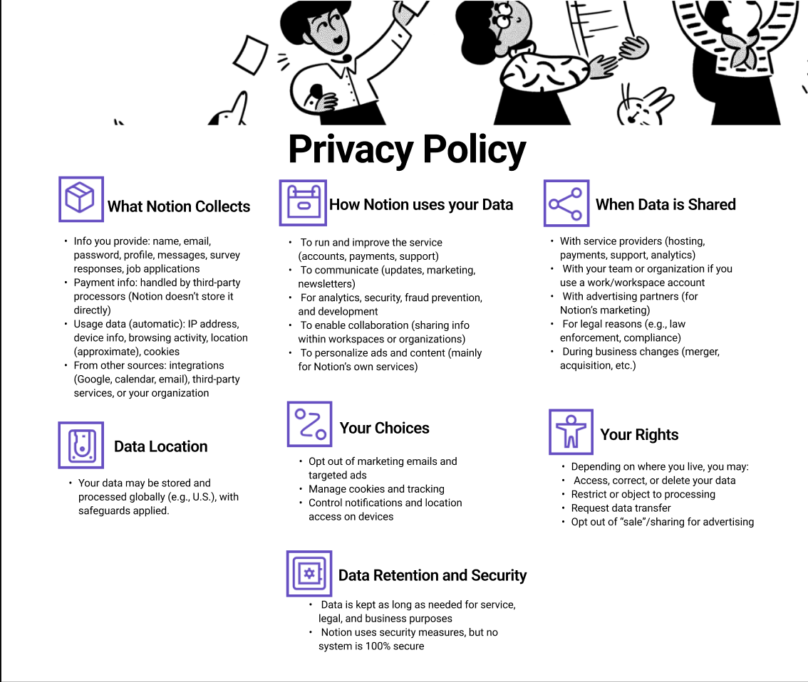
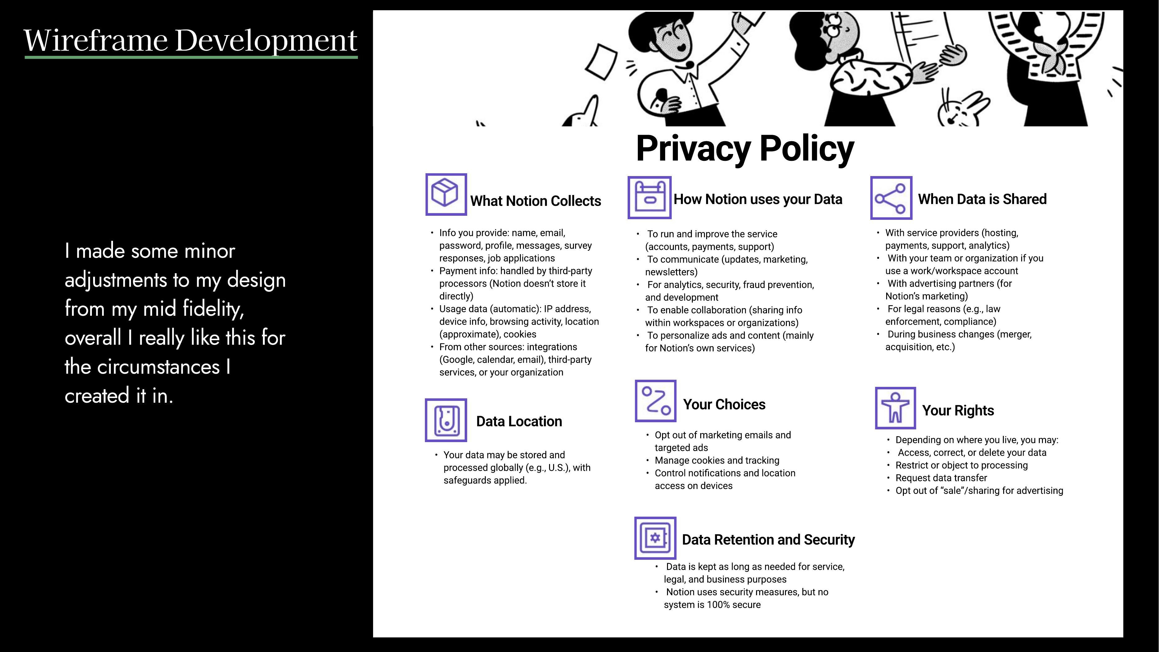
The direction I developed groups the policy around the questions I would actually want answered. What is being collected? How is it used? When is it shared? Where does it go? What choices do I have, and what rights do I keep?
Breaking the policy into those subjects means the user can find the part they care about instead of having to read everything from top to bottom.The final version keeps the full overview visible, but uses spacing and hierarchy so each category can be scanned on its own.
TakeawayThe biggest thing I took from this project is that technically showing information is not the same thing as making it understandable. If the user cannot reasonably get through it, I do not think that is very transparent.